Showing posts with label resist. Show all posts

Wednesday, October 26, 2016

Lado positivo Layout. Up & Scrap Challenge/Reto: Letra va, letra viene

I recently discovered Up & Scrap blog; my husband gave me the best birthday present ever (a cameo 3) and he got it from them, when I checked out the videos they offer to set up and learn the basics of the machine, which were very good by the way, I also saw the monthly challenges. They look very interesting so I decided to participate.
Recientemente descubrí el blog de Up & Scrap. Hace poco mi marido me hizo el mejor regalo de cumpleaños del mundo (una cameo 3) que se la compró a ellos, cuando vi los vídeos que ofrecen para configurar y aprender los conceptos básicos de la máquina, que por cierto son muy buenos, también vi los retos mensuales. Se ven muy interesantes, así que decidí participar.

October´s challenge is called "Letra va, letra viene", which literally means "Letter goes, letter comes", so it is about using lots of letters and fonts on the project. I decided to make a layout because it´s big enough to add a lot of letters and I haven´t made a LO in a while.
El reto del mes de octubre se llama "Letra va, letra viene", que implica utilizar muchas letras y fuentes en el proyecto. Me decidí a hacer un Layout porque es lo suficientemente grande como para añadir un montón de letras y además tenía mucho tiempo sin hacer uno.
So this is my LO. I made it about my daughter´s little accident, she broke her pinkie and we decided to make a list of the positive things she would get out of the stinky situation.
Y este es mi LO. Lo hice acerca del pequeño accidente de mi hija, en el que se rompió el dedo meñique y decidimos hacer una lista de las cosas positivas que podíamos sacarle a esta situación tan desagradable.

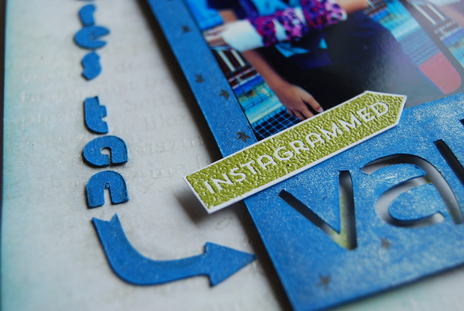
I obviously wanted to use my new cameo, so I designed a frame for my photo with the word "valiente" (brave) on the bottom part. I pop it up a bit with craft foam to give it more dimension and depth to the letters. I also used my cameo to cut out the letters on the side, arrows and hexagons.
Obviamente quería usar mi nueva cameo, hice un simple diseño de un marco para foto con la palabra "valiente" en la parte inferior. Lo levanté un poco con goma eva al pegarlo en mi LO para darle más dimensión y profundidad a las letras. También utilicé la cameo para cortar las letras laterales, flechas y hexágonos.

Since the project involves using lots of letters I went for decorating the background with letters. I stamped my base paper with a large background stamp called "you matter" from Simon Says Stamp, using Versamark ink and clear embossing powder, I wanted to make the resist technique in some areas. Then I highlighted some of the sentences using distress inks and a mini blender tool, I masked the words using post-its and after the words were visible I removed the mask and blended some more ink around.
Como el proyecto implica el uso de un montón de letras decidí que el fondo iría decorado con letras, ja!  Sellé mi cartulina base con un sello grande de fondo llamado "you matter" de Simón Says Stam con tinta Versamark y polvo de embossing transparente, quería hacer la técnica resist en algunas áreas. Entonces resalté algunas de las frases usando Distress Inks y la mini blender tool, hice una máscara para las palabras usando post-its y después que las palabras eran visibles quité la máscara y se mezclé un poco más de tinta alrededor.

You can see there are letters everywhere, some very subtle, and others are clearly showing, the intention was that they not only serve as decoration but also as messages regarding my theme.
Como se puede ver hay letras por todos lados, algunas muy sutiles, y otras se ven claramente, la intención era que no sólo sirvieran como decoración sino también como mensajes relacionados con mi tema.

For the journaling I used my daughter´s help. We made the list together and decided how to put them on the LO, and the hexagons were the winners! I used different fonts a sizes to make them more interesting. I tried to place them around the words I highlighted on the background whenever possible, so I would´t cover all of them.
Para el journaling utilicé mucha ayuda de mi hija. Hicimos la lista juntas y decidimos cómo lo íbamos a poner en el LO, ¡y los hexágonos fueron los ganadores absolutos! Usé distintas fuentes y tamaños para darles mayor interés. Los coloqué tratando que se vieran las palabras o frases que había destacado del fondo, en la medida posible, y así no taparlas todas.

Some hexagons are glued flat on the background and others are raised a bit with craft foam.
Algunos hexágonos los pegué directamente en el fondo y otros están un poco elevados con goma eva.

The title letters I got them in a dollar store many years ago. I added some Wink of Stella Silver Glitter Pen to make it shine a bit and to tone down the brown color that didn´t go so well with the rest of the design.
Las letras del título las compré en una tienda tipo chinos, o dollar store, hace muchos años. Le puse por encima Wink of Stella Silver Glitter Pen, que le da brillo y me sirvió para bajar el tono de color marrón que no iba tan bien con el resto del diseño.

Here I give you more photos to see all the details.
Aquí te muestro más fotos para que veas todos los detalles. 


Have a great day!
¡Que tengas un día maravilloso!

Wednesday, April 20, 2016

Let It Shine online class, lesson 2


Here I am with my card for lesson 2, which required using embossing powder. I used a subtle color from Wow called vintage champagne to emboss both parts of the sentiment, on top of the white cardstock I did some ink blending to make it stand out, and on top of the black cardstock was already very visible.
Aquí estoy con mi tarjeta para la segunda lección, que requería usar polvos de embossing. Utilicé un color muy suave de Wow llamado vintage champagne para el emboss de ambas partes del mensaje, en la cartulina blanca hice una mezcla de tintas suavemente para que destacara, y en la cartulina negra es bastante visible.


I used some of the leftovers from the previous card, like the blue glitter paper.
Utilicé algunas sobras de la tarjeta anterior, como el papel de purpurina azul.

 The sequins give it the final touch.
Las lentejuelas le dan el toque final.
Have a great day!
¡Qué tengas un día genial!

Saturday, February 13, 2016

Video: Masculine Valentine´s cars with watercolors.


I made a card for my husband, we usually don´t give each other presents on Valentine´s day, we prefer to go out and spend time together, but I could´t stop myself from making a card, and I think I´m not breaking the "no gifts" rule we have...haha a card doesn´t count as a gift ;)
Hice una tarjeta para mi marido, normalmente no nos hacemos regalos en el día de San Valentín, preferimos salir y compartir un rato juntos, pero no me pude resistir a hacer esta tarjeta, y creo que no estoy rompiendo la regla de "no regalos" que tenemos...jajaja...una tarjeta no cuenta como un regalo ;)

I wanted to try watercoloring a world map, and I had the idea of stamping it with Distress Ink and then painting on top of it. Since the water would reactivate the ink it would blend beautifully with the colors added on top. I decided to apply regular watercolors, I used a paint set from Winsor and Newton, and they blended perfectly with the Distress Ink.
Quería probar pintar un mapamundi con acuarelas, y tenía la idea de estampar con tinta Distress y luego pintar por encima. Como el agua reactiva el color de la tinta pensé que se mezclaría muy bien con los colores que agregara. Decidí aplicar acuarelas normales, utilicé un set de Winson and Newton, y se mezclaron perfectamente con la tinta Distress.

I made two pictures with the idea of choosing the best one, but both ended up looking great, so I made two cards.
Hice dos imágenes con la idea de escoger la mejor, pero ambas quedaron muy así que hice dos tarjetas.

My main card was the Valentine´s one. I wanted to give it a very personal touch, I know a handmade card it´s already personal but since it is for my husband I wanted that extra touch, where he knew this card was made just for him. So I hand wrote the sentiment, I´m not that confident with my handwriting but that did´t matter, I went for it.
Mi tarjeta principal era la de San Valentín. Quería darle un toque personal a esta tarjeta, ya sé que una tarjeta hecha a mano es bastante personal, pero como es para mi marido quería darle un toque más especial, donde supiera que fue hecha para él. Así que el mensaje lo escribí a mano, no me gusta mucho mi letra, pero decidí no prestarle atención y lo hice.

I hope you enjoy the video and hopefully I gave you some ideas or inspiration.
Espero que disfrutes el video y que te proporcione algunas ideas o inspiración.


 This gorgeous stamp set is from Amy Tangerine.
Este set de sellos tan hermosos son de Amy Tangerine.


Tuesday, November 17, 2015

Watercolor panels card set

I was playing with my kiddos and watercolours...that´s a good combination! They are always eager to try techniques with me, specially if they get to use mom´s supplies ;)
Estuve jugando con mis niños y acuarelas...¡una buena combinación! Ellos siempre quieren intentar hacer técnicas conmigo, en especial si pueden usar las cositas de mamá ;)
We made many watercolor panels. I first heat embossed pieces of watercolor paper with different embossing powder colors, using a hero arts background stamp, then we had fun painting! Each one try different colors and combinations, we used distress inks as watercolors.
Hicimos muchos paneles de acuarelas. Primero hice embossing con calor y diferentes polvos de embossing de varios colores, utilizando un sello de fondos de hero arts, y luego nos divertimos un mundo pintando. Cada uno utilizó distintos colores y combinaciones, usamos distress inks como acuarelas.

This card is very special to me as it was made by my daughter using some scraps, she was trying to imitate the cards I made.
Esta tarea es muy especial para mi porque fue hecha por mi hija utilizando retazos, trató de imitar las tarjetas que hice.
I wanted to keep the cards simple and give focus to the panels, so I only added the sentiment and a few leaves I die cut out of coloured vellum paper.
Quería hacer unas tarjetas sencillas y darle protagonismo al panel que creamos, así que solo le agregué el mensaje y unas hojas que troquelé de papel cebolla de colores.


I hope you like them ;)
Espero que te gusten ;)

Monday, October 26, 2015

Tags with different textures

These are 3 tags I made with my friend Isabel, she guided us to make 3 different textures with different media.
Estas son 3 tags que hice con mi amiga Isabel, nos guió para hacer 3 tags diferentes con texturas usando distintos materiales.
They are simple gorgeous, I haven´t used them on any project as I want them to be on a very special one. Love them!
Son hermosas, no las he utilizado en ningún proyecto todavía porque quiero que sea en uno muy especial. Me encantan!

Friday, October 2, 2015

Halloween Cards

 I made a couple of Halloween cards. I had the idea of drawing my own spider web, so I drew it with a versamark pen and white heat embossed it. I tried two effects, one with a light pressure on the pen and another with more defined and thicker lines. Both had good results.
Hice un par de tarjetas para Halloween. Tenía la idea de dibujar la telaraña, así que la hice con un rotulador Versamark y emboss de color blanco. Probé de dos maneras, una haciendo poca presión con el rotulador y otra con líneas más definidas y gruesas. Ambas me dieron buenos resultados. 
 Then I used Distress Inks and the distress tool to blend the ink for the background, I love to see how the embossed areas resist the ink and the design comes to live.
Luego utilicé tintas Distress y la herramienta para difuminar la tinta en el fondo, me encanta ver como la parte que tiene el emboss resiste la tinta y comienza a verse el diseño.
 For the sentiments and elements of the card I used a stamp set from Stephanie Barnard. I heat embossed them with black, then added some shimmer with a Wink of Stella clear brush pen to the hat and ghost.
Para los mensajes y elementos de las tarjetas utilicé un set de sellos de Stephanie Barnard. Los coloqué haciendo embossing con calor en negro, y luego le agregué algo de brillo al sombrero y al fantasma con un Wink of Stella clear brush pen.
 I´m entering these cards for the Simon Says Stamp Monday Challenge.


Monday, April 21, 2014

Araguaney

 This is a layout I made about a tree called "Araguaney". It is the national tree in Venezuela.
Esta es una página que hice sobre un árbol llamado Araguaney. Es el árbol nacional de Venezuela.
 This was a commission I got from some friends to decorate their Cafe. I made all the pictures they have at the Cafe a few years ago and they wanted to add an Araguaney as that's the name of their place. Antojos Araguaney Gourmet.
Here you can see the posts about those pictures: post 1, post 2, post 3, post 4, post 5.
Este trabajo fue un encargo que me hicieron unos amigos para decorar su Café. Hace unos años hice los cuadros para decorar el Café y querían que agregáramos otro de un Araguaney ya que ese es el nombre de su Café: Antojos Araguaney Gournet.
Aquí se pueden ver los posts con los cuadros que hice hace un tiempo: post 1, post 2, post 3, post 4, post 5. 
 It looks really cool in the frame.
Se ve muy bien enmarcado.


Wednesday, April 9, 2014

40th bday Card

I made this card for my hubby's 40th birthday. I'll see him tomorrow and finally we"ll be able to celebrate his big (not too big) 40th birthday ;)
I'm loving all these watercolors techniques.
I saw this "quote" on pinterest and wanted to use it on my card. I hand-wrote the sentiment because I wanted a very distressed look. I white heat embossed the letters then I wet the area where I wanted the colors and added the watercolor overlapping them a bit.
Hice esta tarjeta para el cumpleaños 40 de mi marido. Lo voy a ver mañana y por fin podremos celebrar su gran (no tan grande) cumpleaños número 40 ;)
Estoy enganchada a todas estas técnicas de acuarelas. 
Encontré esta "cita" en Pinterest y quería usarla en mi tarjeta. Escribí a mano el mensaje porque quería mostrar un estilo casual. Hice embossing blanco para las letras y luego mojé la zona donde quería los colores, y comencé a agregar las acuarelas, superponiendo los colores un poco.